Data visualization with maps in QGIS
- Darsh Vatsa

- Aug 24, 2022
- 10 min read
Updated: May 24, 2025
Create interactive data maps using the QGIS Application with our walkthrough tutorial.

The importance of data visualization
Data plays a vital role in sustainable development. It tells us what problems we face as a society, the consequences of unsustainable development, and how we have been addressing these problems. By doing so, data acts as a catalyst for the framing of sustainable policy frameworks. Further, visualization of this data makes the information more accessible to a wider audience, aiding mobilization, dissent, and discourse within civil society.
This blog provides a comprehensive tutorial on how to create interactive maps using the QGIS Desktop Application.
The QGIS Application
A Geographic Information System, or GIS, is a database format where data is stored as real-world geographic information. Any data relevant to a specific location can be stored as GIS. For example, if data on Maharashtra’s forest cover is stored as an Excel sheet, it is a simple database. If we add it to a map where only the geographical area of Maharashtra displays the data for the state, it is stored as GIS.
QGIS is a free open-source application that contains a vast set of features to help you work with maps and datasets. The QGIS Desktop Application—which is what we are using for this tutorial—lets you create maps, link them with data and publish them for wider access. You can download the latest version of QGIS Desktop from their website: https://www.qgis.org/en/site/

Working with QGIS
The tutorial aims to create a choropleth—a kind of map where each unique value gets a different colour on a map—of India’s state-wise forest cover. The two types of files which we will be using to create this are:
The geometrical outline of each State and Union Territory.
A database with the forest cover data.
Step 1: Setting up the Project
Open the QGIS Application. Go to Project > New and create a new project.

The main view panel will display a blank white sheet when you make a new project. This is where our map will go. To load a world map, we will use the OpenStreetMap Plugin. Go to Plugins > Manage and Install Plugins

Search for “QuickMapServices” and install the plugin in the Plugins window. Close the window upon successful installation.

The installation of the Plugin will add the QuickMapServices option to the Web tab. Go to Web > QuickMapServices > OSM > OSM Standard.
This will load a world map in the view panel. You can move, pan, and use this map like any other map. Our base project is now created. From here, we will load the required files. Don’t forget to save your project regularly.
Step 2: Loading the Geometry
Our database containing each State and Union Territory’s forest cover cannot be loaded onto the plain OSM Standard Map. For this, we will load the geometry of each state to the map. This type of file is called a Shapefile. A Shapefile has the geometry of the given location(s) loaded into it, with the location’s coordinates. When loaded onto a map, the geometry of the place gets loaded exactly on its real location.
For this project, I will be using a Shapefile of Indian State Boundaries. You can access this file here.
To load the shapefile, go to Layer > Add Layer > Add Vector Layer. This will open the Data Source Manager window.

In the Data Source Manager window go to the Vector Dataset(s) field and click on the three dots (...). Select the StateBoundary.shp file from the folder and open it. Once loaded, select Add and Close the window. The geometry of each state should now be loaded onto the World Map

Step 3: Setting up the Data
Let’s first look at the database with the Forest Cover of each State and Union Territory. Here is the data I have collected from the India State of Forest Report 2021 in Microsoft Excel:

The ISFR 2021 divides the Forest Cover data into 5 fields: Very Dense Forest, Moderately Dense Forest, Open Forest, Total Forest Cover, and Total Forest Cover Percentile against the total geographical area. You can find the table that I have created here.
The Shapefile already contains the name of each state in a spreadsheet format. The state name is also the only data that the Shapefile currently has in common with the Forest Cover data. To view this, right-click on StateBoundary > Open Attribute Table.

From here, we can add our data to the Shapefile spreadsheet either manually or by joining it with the Excel sheet we have. Directly joining is a much easier process and takes less time, but manual entry can be helpful when direct joining displays any error.
To add data manually:
Double-click on the StateBoundary layer. This will open the Layer Properties. Now select Fields. Here we can add new data fields. For this click on the Pencil icon to enable editing and then select the yellow-coloured table icon (New Field). This should open the Add Field window.
In the Add Field window, add “VD Forest” as the Name since this is our second field in the Excel sheet as well. It won’t take the full name “Very Dense Forest” because of the text limit on Field Names. Also, select “Decimal Number (Real)” as the Type because we are adding numerical data.

This should create a new field titled “VD Forest” below State in the Fields list.

Similarly, create the other 5 fields as visible in the Excel sheet. Remember to keep the type as “Decimal Number (Real)” for all the fields. Once done, the field list should look like this:

Click on the Pencil icon to disable editing and save the changes. Now that the fields are created, we will move on to adding the data.
Go to the layers panel > Right Click on StateBoundary Layer > Open Attribute Table. Opening the Attribute Table will give you a sheet with “NULL” data in the newly created fields. Now you can copy data from the Excel sheet and start entering it here one by one. Once done, the table should look something like this:

To join CSV data with the Shapefile:
QGIS joins CSV and Shapefile through common fields. For example, the State name is the one field common in both the spreadsheet and the shapefile, so when we join these two files, the State name will be the node.
If the Shapefile has “Jammu and Kashmir” as the State name while the CSV data has “Jammu and Kashmir [inclusive of Ladakh]” as the State name, the data for J&K will not get copied because the application won’t be able to locate the similarity. Currently, we face such problems primarily in the case of the Union Territories of Jammu and Kashmir, Ladakh and Daman and Diu and Dadar and Nagar Haveli.
The state of Jammu and Kashmir was divided into the Union Territories of Ladakh and Jammu and Kashmir while the Union Territories of Daman and Diu and Dadar and Nagar Haveli were merged into a single union territory. In some cases, however, the data doesn’t follow these changes, which causes issues while working in applications like QGIS.
Check the spreadsheet for the slightest differences between it and the shapefile and fix the anomalies. Then, export it as a .csv file:

Once this is done, we can move on to linking our files. In the QGIS Application, go to Layer > Add Layer > Add Delimited Text Layer

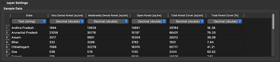
When the Data Source Manager window opens, browse and upload your CSV file by clicking on the three dots (...). Ensure that CSV is selected as the File Format and No Geometry is selected under the Geometry Definition field.

In the Sample Data table, make sure that the format of all fields with numerical data is set to Decimal (double). With the file settings configured, select add and close the window.
You should now be able to see the CSV file as a new layer in the Layers Panel. Right-click on it and open the attribute table to view the data that has been loaded.
Now that the CSV file has been added, we will link it to the Shapefile.
Double-click the StateBoundary Layer and open the Layer Properties dialogue. Select Joins from the menu on the left. Then select the Add New Join (+) button on the bottom. This should open the Add Vector Join window.
Make sure that your Data layer is selected in the Join Layer field. Select the common fields from the Database and the Shapefile as the Join Field and Target Field respectively (“State” in this case).

Select OK and close the Layer Properties window. Now, if you open the StateBoundary Layer’s Attribute Table, you will see all of the Forest Cover data from the spreadsheet added to newly created fields. Each state and union territory’s forest cover data is now connected to its geometry.
Step 4: Building the Choropleth
With the data loaded, we must now visualize the data with colors on the map. We will use the Forest Cover Percentage of each state as the field on which to base our choropleth, because this gives us a more stable view of one state’s forest cover against the other.
Double-click on the State Boundary layer > Select Symbology from the Menu on the left > Select the dropdown on the top where Single Symbol is pre-selected > Select Graduated. Graduated gives us a gradient to apply to each state based on a specific legend. We will now create this legend.
First, click on the Value dropdown and select the TForest % field. Then select Natural Breaks (Jenks) from the Mode dropdown. This should give us a legend that looks like this:

Let’s create 10 classes of colors in the legend and change the values to 0-10, 10-20, 20-30… To change the number of classes select the classes field on the bottom and replace 5 with 10. Then double click on the values to get an editing panel to alter the upper and lower values for each class.
Our panel should look something like this after making these changes:

To change the gradient, click on the dropdown arrow next to the Color Ramp and select from one of the available gradients. You can also click on the ramp to customize the gradient. I am making a ramp that transitions from Red to Purple, which looks like this in the customization dialog:

Select OK and that will apply our gradient to the map. With these edits, our Choropleth is created:

Publishing as PNG, PDF, or SVG:
Now that our data has been translated into a map visual, it’s time to publish it. Go to Project > New Print Layout. Give a name to the Print Layout in the dialog box and select OK. In the new Print Layout dialog, select Add Map.

Drag the cursor to create a space for map placement on the white sheet.

As you can see, our map needs to be zoomed in. Select the Move Item Content tool from the menu on the left.

You can now zoom in within the Map embed (preferably do this while holding Ctrl./Cmnd. to zoom in smoothly). You can also move it around using the cursor. This is what Zoom and Drag rendered for me:

With the map in place, let’s put in the legend so that viewers can refer to it and understand which color corresponds to which set of values. Select Add Legend from the Menu on the left and drag the + cursor to create the placement space for the legend.

You will notice that the names of all the layers are visible in the newly added legend. To fix this, save the Print Layout and go to the Layers Panel. Rename the OSM Standard, CSV, and StateBoundary layers to a blank.

Reopen the Print Layout by going to Project > Layouts > Name of your Print Layout

The legend should now reflect the edits we just made. Now, let’s first give a name to our legend (I am naming it “Forest Cover [%]”). Double-click on the legend on the Page > Open the Item Properties tab and name the legend in the Title field.
Scroll down to the Fonts and Text Formatting field. Make changes to the font under “Legend title” to design the heading we just added, and under “Item Labels” to design the numerical values in the legend classes. These are the changes I am making to my fonts:
Legend Title Font: Font: Inter; Font Style: Medium; Size: 18
Item Labels Font: Font: Inter; Font Style: Regular; Size: 16
Let us also make design edits to the color symbols and play around with the spacing option. Scroll down in the Item Properties tab to the Symbol panel. Here you can make changes to the width and height of the color symbols. I am making the following changes:
Symbol Width: 10mm
Symbol Height: 6mm
You might have to resize the legend object on the page to fully view these changes. Scroll further down to the Spacing panel and you will see options to deal with spacing in our legend. I am making these changes here:
Legend Title: Space below: 2mm
Legend Items: Space between symbols: 7.50mm; Symbol label space: 4mm
General: Box space: 0mm
The design changes should be visible on the legend. You can drag it around to align it correctly on the page. I am moving it more toward the right and placing it in the vertical center. I am also giving some more space for the map content.
This is what my layout looks like with all these design edits:

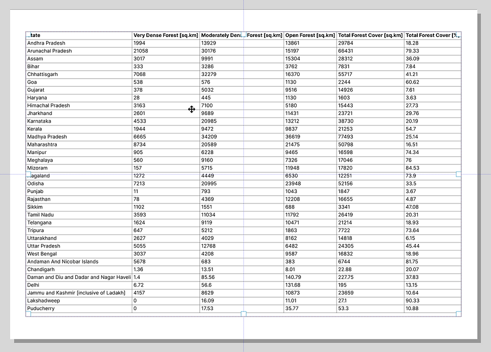
We can also add our Forest Cover data as a table to our layout. Since our first page is already occupied by the map and the legend, let’s first create a new page. Select Add Pages from the tools on the top:

In the Insert Pages dialog box, check the page properties and click on Add. This should add a new page to the layout which is where we will add our data. Expand the toolbar on the left and select Add Attribute Table:

Use the + cursor to create space for the table to be displayed in. You will quickly notice that the table isn’t displaying all the rows. To fix this, double-click on the Attribute Table and select the Item Properties panel on the right. Scroll down to Feature Filtering and replace the value in the “Maximum rows” field with the total number of rows in the data, which is 35 in our case. After changing the value, stretch the table downwards till the time all the rows are not visible.
We now have our whole table visible, but the data is going out of the page margins. To fix this, we will have to make some design changes. Scroll down in the Item Properties panel to the Show Grid option. Reduce the line width down to 0.1 mm. Scroll up to the Appearance option and reduce the Cell Margin to a value that sufficiently fits the table on the page [0.10mm worked for me]. The table is now beginning to fit the preview.

Now scroll down to the Fonts and Text Styling section and change the size for both the Heading Font and the Table Contents Font to 9 points. This should finally bring the table entirely inside the Page’s margins. Resize the table as desired and organize the alignment.
Our Print Layout is ready for export as PNG, PDF, or SVG. You can also edit the export properties like the DPI and Resolution of the layout by scrolling down to the Export Settings panel under the Layout tab for the entire page.
Save the Print Layout and head to the Toolbar on the top. Here you can find options to either export it in the aforementioned formats or to directly print it:

Ignore the WMS Layer warning dialog if it pops up and export the file. Your choropleth is now ready. You can also view the PDF Export of my project here.


Comments